
data vs management information
One row changes a decision. The rest is just data.
Most mid-market businesses have an MIS pack — a monthly, sometimes weekly, bundle of tables, charts, and summaries that circulates to leadership on schedule, gets reviewed, and is generally treated as a sign the business is being run with discipline. And in a genuine sense, producing it consistently is discipline. But there’s a harder question worth asking about most of these reports, and it’s rarely asked directly: does anything actually change when this report arrives?
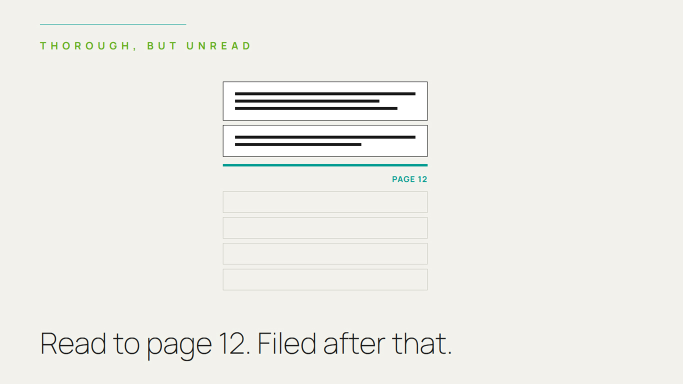
If the honest answer is no — if the numbers get reviewed, nodded at, and filed, with no specific decision hinging on what they show — then what’s being produced isn’t management information. It’s just data, formatted well enough to look like it’s being used for something.
The distinction that matters
Management information, properly understood, is information a specific person uses to make a specific decision. Data is simply a fact that’s been recorded and organised. The two look identical on the page — the same tables, the same charts, the same monthly cadence — but they function completely differently inside a business.
A number is management information if someone can say, honestly: “if this figure crosses this threshold, I do this.” A number is just data, however well-formatted, if nobody could actually name what would happen differently depending on what it showed. Most MIS packs are a mixture of both, and the problem is that nobody’s ever separated the two — so the report gets treated, in its entirety, as if all of it is driving decisions, when in practice most of it is simply being observed.
Why this gap is so easy to miss
A well-produced MIS pack looks like exactly the right thing to have. It’s professional, it’s thorough, it circulates on schedule, and producing it consistently genuinely does take real discipline and effort. All of that visible quality makes it easy to assume the report is doing its job — because the alternative, that a polished, carefully maintained report might not actually be changing any decisions, feels like an uncomfortable thing to consider about work that’s clearly being done well.
The gap tends to widen over time in a specific, familiar way: a report starts focused and decision-linked, then accumulates additional metrics over the years — someone asked for one more chart, a new KPI got added after a specific incident, a comparison got included because it seemed generally useful — until the report has grown into something comprehensive, impressive, and substantially disconnected from any specific decision anyone is actually making with it.
How to actually tell the difference
There’s a simple, slightly uncomfortable test worth running against your own MIS pack, section by section: for each number or chart, ask who specifically is meant to act on it, and under what condition. If that answer comes quickly and specifically — “the sales head reviews this weekly and adjusts territory allocation if it drops below X” — that’s genuine management information. If the answer is vague, generic, or takes a while to construct — “it’s good to keep an eye on,” “it gives us visibility” — that’s data being carried along for reasons that were never quite pinned down.
Running this test honestly across an entire report is often uncomfortable, because it tends to reveal that a large share of a carefully maintained MIS pack is, functionally, decoration — accurate, well-organised, and not actually driving anything.
What a genuinely useful MIS looks like instead
It’s built backwards from decisions, not forwards from available data. The right starting question isn’t “what can we measure” — it’s “what decisions do we make regularly, and what specific number would need to inform each one.” Everything in the report should trace back to a named decision and a named decision-maker.
It’s shorter than people expect, once the decoration is removed. A report built strictly around actual decisions is almost always leaner than the version that accumulated organically over years. That leanness isn’t a loss of rigour — it’s the removal of information that was never actually being used for anything.
It has explicit thresholds, not just numbers. “Revenue: ₹4.2 crore” is data. “Revenue below ₹4 crore triggers a pricing review” is management information. The difference is entirely in whether a specific action is pre-defined against the number, rather than left to be decided fresh each time, or not decided at all.
Someone is actually accountable for acting on each section. A number without a named owner tends to be watched passively rather than acted on. Assigning explicit ownership — this metric, this person, this trigger — is what keeps a report connected to real decisions rather than drifting into general background awareness.
The reframe worth making
Producing a thorough, well-formatted monthly report is not, by itself, evidence of good governance. Good governance is decisions actually changing in response to what the numbers show. A business with a shorter, sharper report tightly linked to specific decisions is being run with more discipline than one circulating an impressively comprehensive pack that nobody could honestly say has changed a single decision in the last year.
If your monthly report is thorough but you’re not sure the last decision it actually changed, that’s worth an honest look before the next one goes out. See how our Finance & Governance practice works →