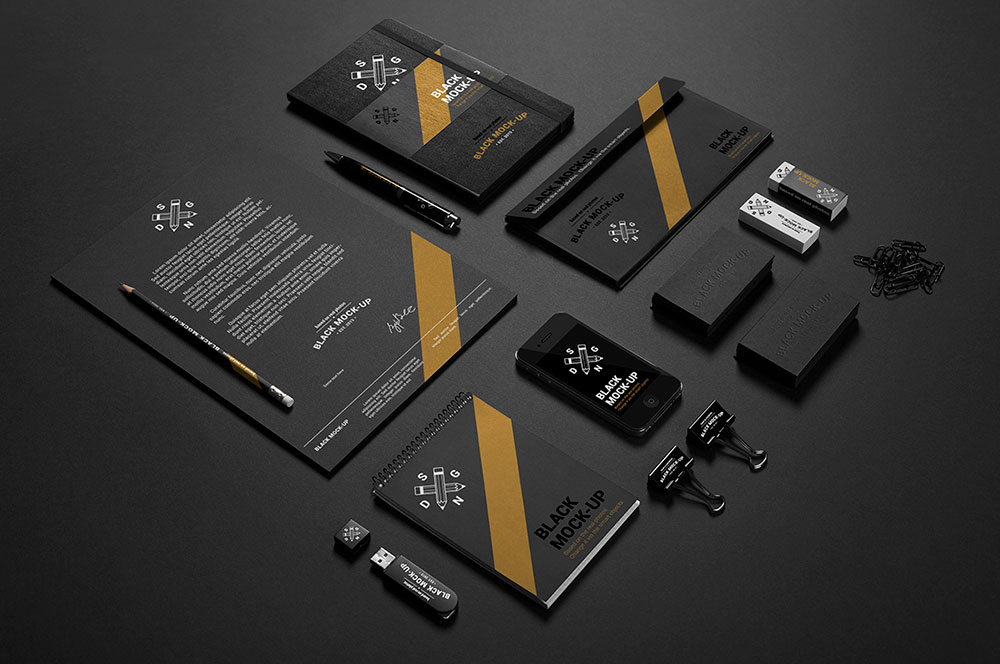
The popular perception of what goes into creating a Brand Identity is that it involves creating the ‘logo’ for the company or brand. This of course is very far from the truth. The reason there are intense discussions, brain-storming, strategy-building, and others is that a brand is an embodiment of all the values, characteristics, personality, and features of a brand. While the logo is a starting place there are several components to designing a brand identity. The number of these components or elements or also dependent on the industry category, budget available, and finally brand life cycle that the owner wishes.
So to get the obvious out of the way, a usual brand identity document (which is prepared as a result of designing the brand) will contain:
- The Logo
- Variations of the Logo – colour, black and white, proportions, baselines (with and without)
- Usage guidelines of the Logo – how does it go in various situations/media – combined with what variations of the Logo to be used
- Colour pallete – all the colours that the brand can use in its communication across various media – generally the colour pallete is divided into primary colours, secondary colours and thereafter tones. The colour pallete will also include the values of each colour given in different colour systems like RGB, CMYK, Pantone and so on
- Usage guidelines of the colour pallete – how to use the various colours in conjunction or independently of each other and other elements like images or materials
- Font Suite – what would be the various fonts that can be used by the brand in its communication – these would include fonts for various types of uses and generally could also include icon fonts (for web uses)
- Usage guidelines for the font suite – what kind of fonts go with the different types of typography – headlines, body copy, special occasion and so on – along with size, weight and colour specifications on both dark and light modes
- Image gallery – a sample of the types of images to be used along with the treatment of images – like should they be only vector or only raster, should they be close-ups or inanimate and similar such stuff
- Usage guidelines across different media – combining the logo, colour pallete, font suite and image gallery, different usage samples are also given – for example outdoor media, print ads, website feel, merchandise and similar
- Stationery – the corporate stationery are a critical part of the brand identity which would generally involve business cards, letterheads, folders, id tags, name boards and so on
- Templates – different kinds of templates based on usage requirements (reports, forms and so on)
So it is a very, very big list! And the amount of work that goes in is tremendous. So while people might think the job ends with a logo selection, the actual job only starts then!


Leave A Comment